Year 6 Art Inspired by Tim Winton’s Blueback
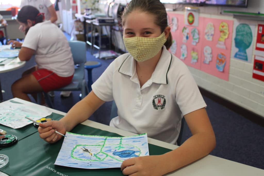
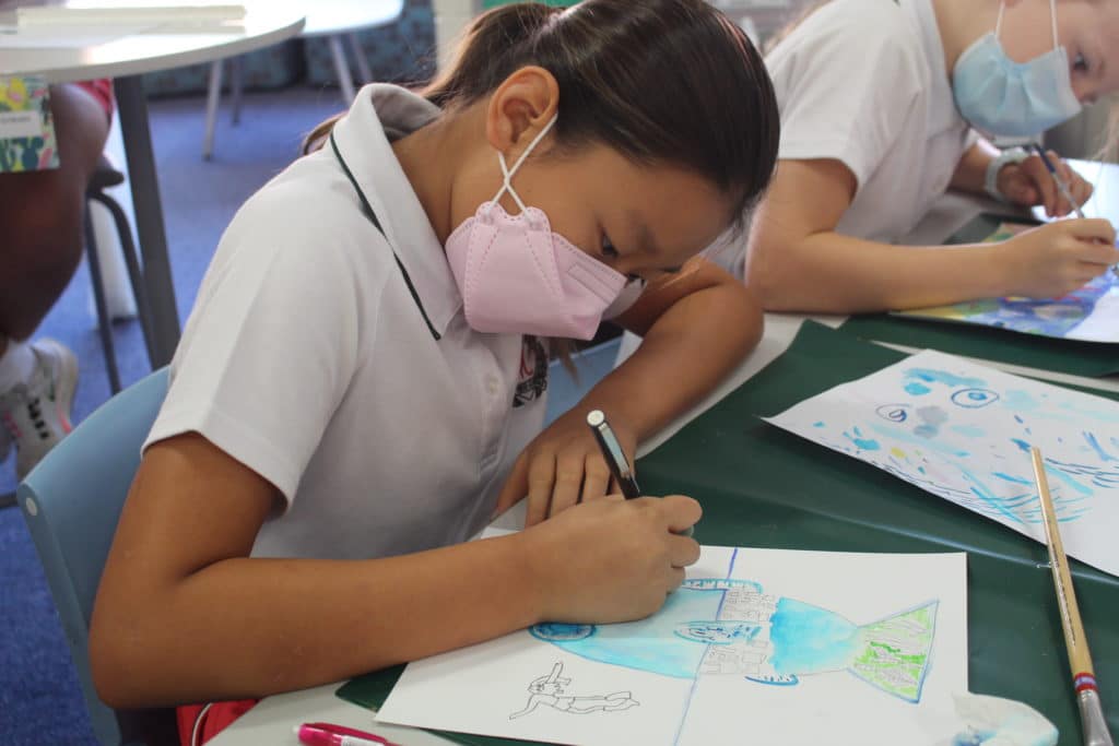
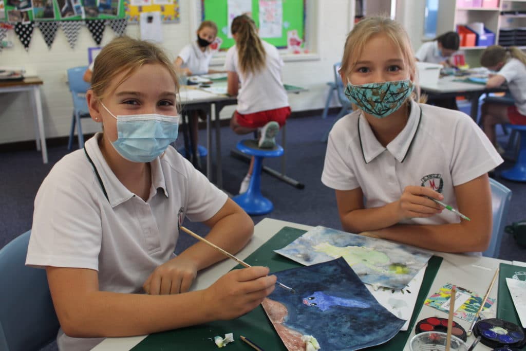
In Class 6.6, students have been reading Australian author Tim Winton’s classic novel, Blueback, which explores themes around the ocean.
After discussing the story’s themes, the girls felt there were many messages about appreciating the ocean, stopping overfishing, protecting coral and all the beautiful fish.
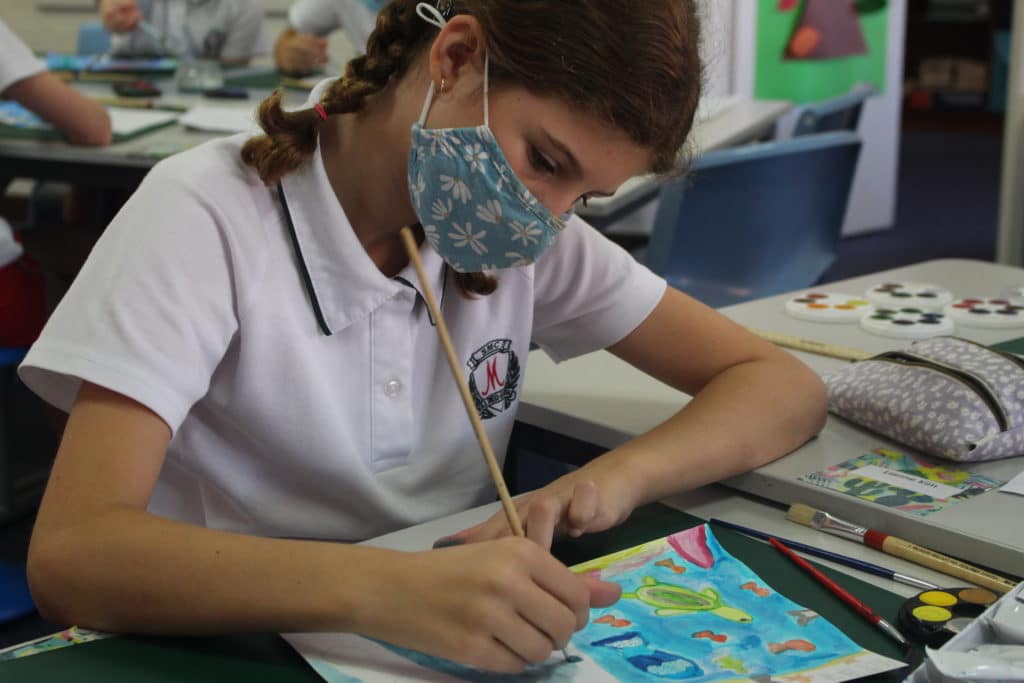
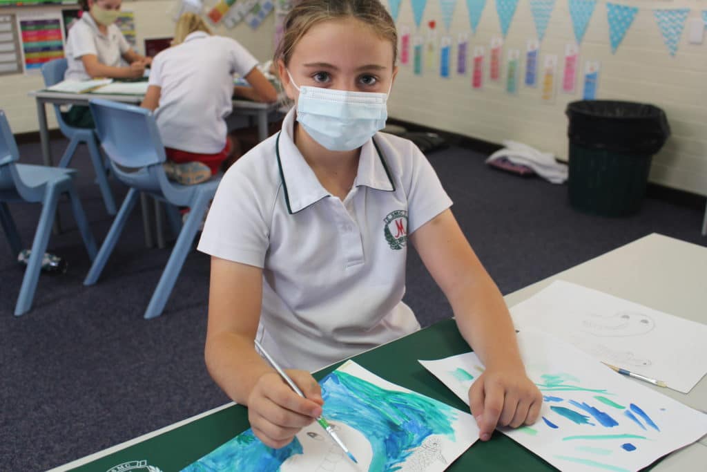
With that in mind, the girls created a painting to portray one of these messages.
To accompany their piece, they also wrote an artist statement to explain what they created, how they created it and why. There was some very thought-provoking paintings!
Here is what some students had to say:
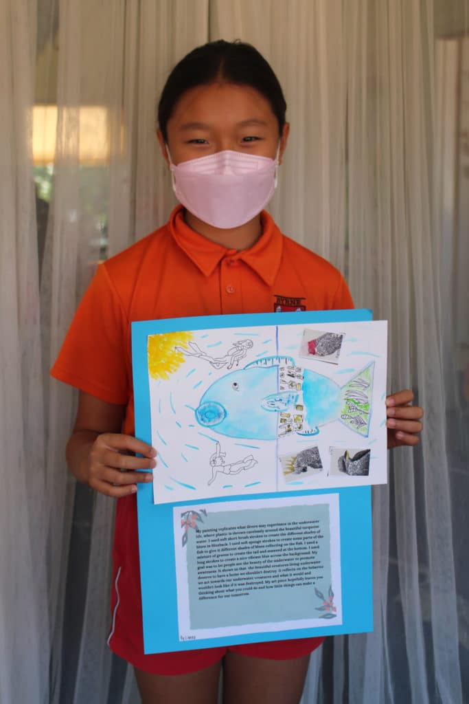
My painting replicates what divers may experience in underwater life, where plastic is thrown carelessly around the beautiful turquoise water. I used soft short brush strokes to create some parts of the fish to give it different shades of blues reflecting on the fish. I used a mixture of greens to create the tail and seaweed at the bottom. I used long strokes to create a nice vibrate blue across the background. My goal was to let people see the beauty of the underwater to promote awareness. It shows us that the beautiful creatures living underwater deserve to have a home we shouldn’t destroy. It reflects on the behaviour we have towards our underwater creatures and what it would and wouldn’t look like if it was destroyed. My art piece hopefully leaves you thinking about what you could do and how little things can make a difference for our tomorrow. Lianne Kim
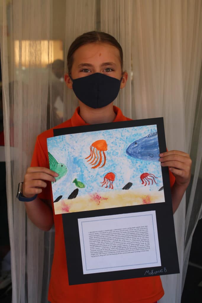
I decided to create a landscape underwater scene using both warm and cool colours. When I finished it came out very vibrant and I think my dish and shells came out bold. I used a dabbing technique to make my ocean look a bit like real water. Another thing I did to make my water look more realistic was using watercolour instead of acrylic paint. I used a lot of blending so my lines wouldn’t come out really bold. I purposely did the jellyfish warm colours and the other fish cool colour. I did this because I wanted the jellyfish to stand out in the blue background and the other fish to blend in a bit more. I used some sponges to create a different texture for the fish. I created this artwork to focus on the beauty of the ocean. I used lots of bright happy colours so when people look at my artwork instead of feeling sad and guilty for polluting the ocean, they’ll feel really happy. MaKenzie Brown
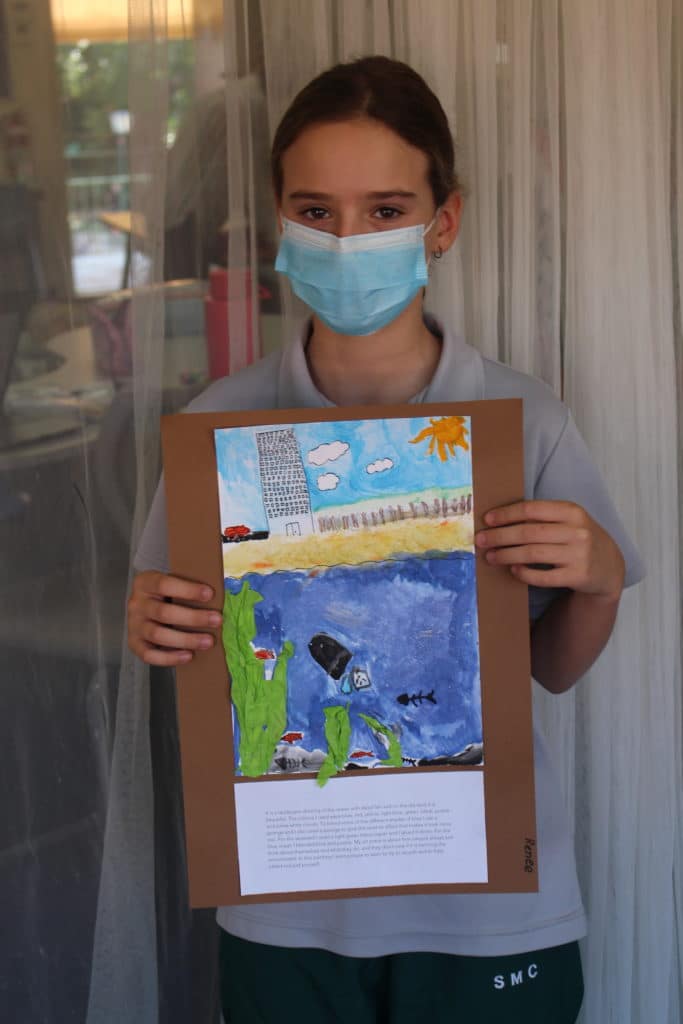
It is a landscape drawing of the ocean with dead fish and on the dry land it is beautiful. The colours I used were blue, red, yellow, light blue, green, black, purple and some white clouds. To blend some of the different shades of blue I used a sponge and I also used a sponge to give the sand an effect that makes it look more real. For the seaweed, I used light green tissue paper and I glued it down. For the blue ocean, I blended blue and purple. My art piece is about how people always just think about themselves and what they do, and they don’t care if it is harming the environment. In this painting I want people to learn to try to recycle and to help others, not just themselves. Renee Rhodes
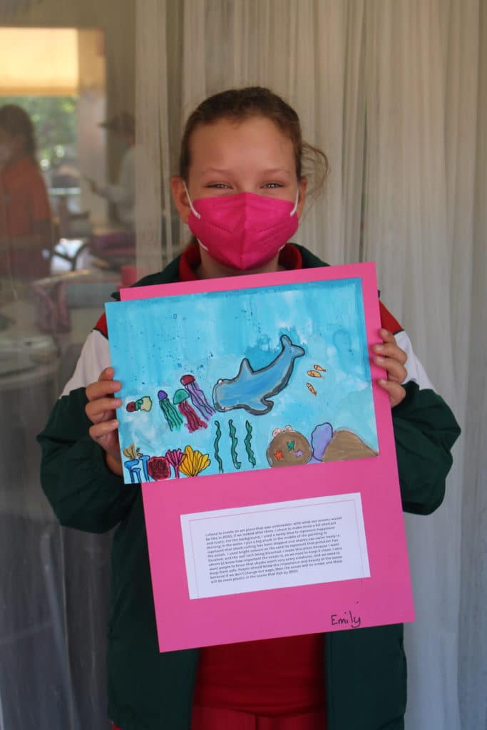
I chose to create an art piece that was underwater, with what our oceans would be like in 2050 if we looked after them. I chose to make mine a bit abstract and rustic. For the background, I used a lovely blue to represent happiness thriving in the water. I put a big shark in the middle of the painting to represent that shark culling has been stopped and sharks can swim freely in the ocean. I used bright colours on the coral to represent that pollution has finished, and the reef isn’t being bleached. I made this piece because I want people to know that sharks aren’t very scary creatures, and we need to keep them safe. People should know the importance and beauty of the ocean because if we don’t change our ways, there will be more plastic than fish by 2050. Emily Grieves
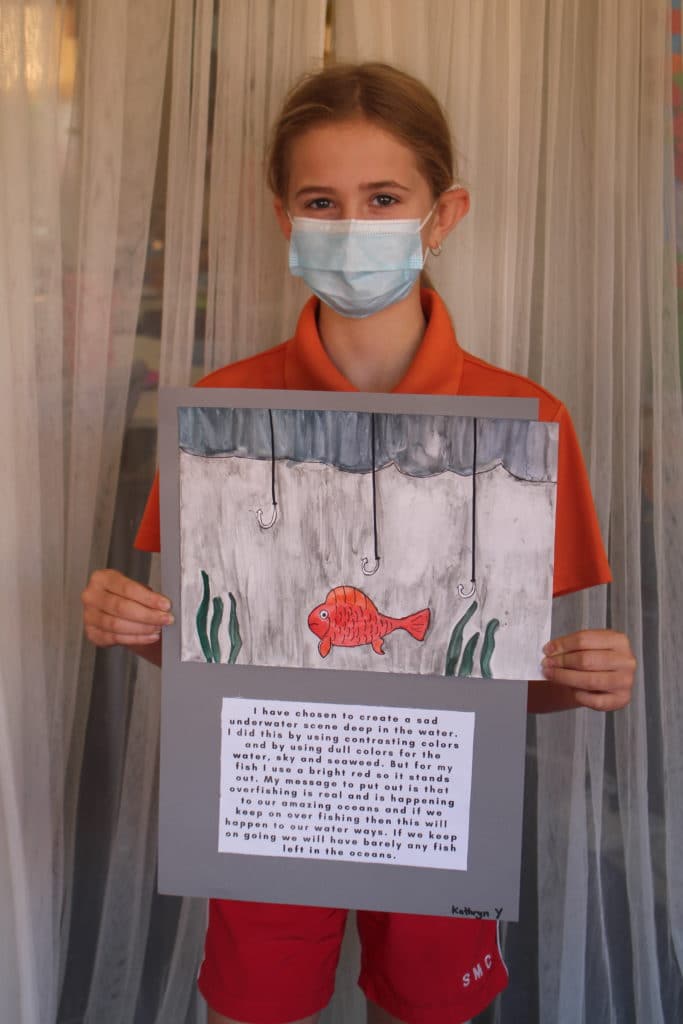
I have chosen to create a sad underwater scene deep in the water. I did this by using contrasting colours and by using dull colours for the water, sky and seaweed. But for my fish, I used a bright red so it would stand out. My message is that overfishing is real and is happening to our amazing oceans and if we keep on overfishing then this will happen to our waterways. If we keep on going we will have barely any fish left in the oceans. Kathryn Young
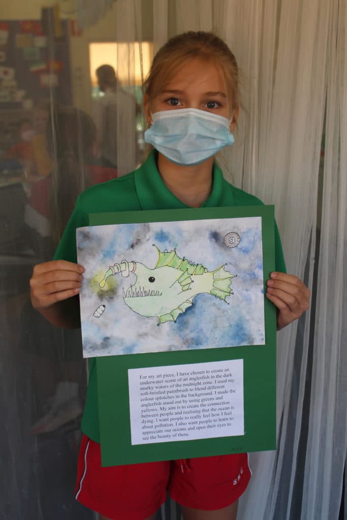
For my art piece, I have chosen to create an underwater scene of an anglerfish in the dark murky waters of the midnight zone. I used my soft-bristled paintbrush to blend different colour splotches in the background. I made the anglerfish stand out by using greens and yellows. My aim is to create a connection between people and realising that the ocean is dying. I want people to really feel how I feel about population. I also want people to learn to appreciate our oceans and open their eyes to see the beauty of them. Layla MacLeod
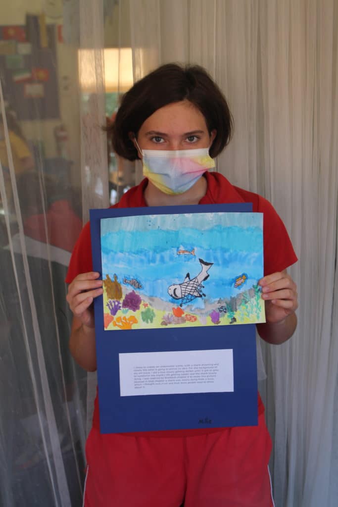
I chose to create an underwater scene, with a shark growing and slowly the coral is going to pierce its skin. For the background of my art piece, I did a blue slowly getting darker until it got grey, to symbolise the shark’s life getting sadder and the shark slowly dying. I was inspired by Blueback chapter 8 to make this picture because, in that chapter, a shark was slowly dying for a buoy, which I thought was cruel and that more people need to know about it. Millie McCarthy
I think we can all agree the girls produced some phenomenal paintings and artistic statements!
Year 6 Teacher, Lindsey Fitzgerald, was very impressed with the outcome of the project. A massive well done to the girls.
Santa Maria Teams Shine in Term 1 Sports
Santa Maria had a huge number of girls in the IGSSA AFL and Volleyball competition with strong results for a number of teams.
Lee-Elle’s Insights from the ‘Make it 16’ Forum
Lee-Elle Cooper is a passionate Year 12 student who advocates for youth engagement and political participation. She has recently returned from the Make It 16 Forum in Canberra.

With Laurissa Knowles From Valley Depths to Mountain Peaks (1993)
Laurissa Knowles (1993) has had an incredible career journey so far, from Santa Maria College Teacher to Celebrant and Councillor.
- ConnectingLearning2Life, Creativity, Featured, Learning4Life
Author: Santa Maria College
Santa Maria College is a vibrant girls school with a growing local presence and reputation. Our Mission is to educate young Mercy women who act with courage and compassion to enrich our world. Santa Maria College is located in Attadale in Western Australia, 16 km from the Perth CBD. We offer a Catholic education for girls in Years 5 – 12 and have 1300 students, including 152 boarders.